
Building a clean, modern login page is one of the best ways to practice front-end development. In this tutorial, you’ll learn how to create a fully functional Efimo-style login page using just HTML and CSS no frameworks, no JavaScript libraries, just pure code.
What You’ll Learn
- How to structure a login page using semantic HTML.
- How to style forms with modern CSS techniques.
- How to add hover effects, transitions, and gradients.
- How to make the page responsive for mobile devices
Prerequisites
Before starting, make sure you have:
- A code editor (VS Code, Sublime Text, or Notepad++).
- A web browser (Chrome, Firefox, or Edge).
- Basic understanding of HTML and CSS.
Set Up the Project Structure
Create a new folder called efimo-login and inside it, create two files:
efimo-login/
├── index.html
└── style.css
Write the HTML Code
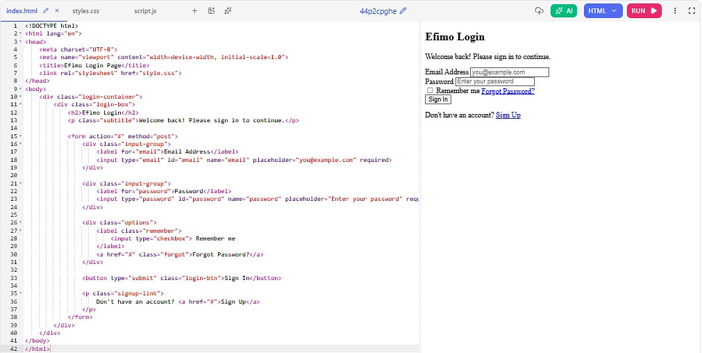
Open index.html and paste the following code. This forms the skeleton of your login page.
html
<!DOCTYPE html>
<html lang="en">
<head>
    <meta charset="UTF-8">
    <meta name="viewport" content="width=device-width, initial-scale=1.0">
    <title>Efimo Login Page</title>
    <link rel="stylesheet" href="style.css">
</head>
<body>
    <div class="login-container">
        <div class="login-box">
            <h2>Efimo Login</h2>
            <p class="subtitle">Welcome back! Please sign in to continue.</p>

            <form action="#" method="post">
                <div class="input-group">
                    <label for="email">Email Address</label>
                    <input type="email" id="email" name="email" placeholder="you@example.com" required>
                </div>

                <div class="input-group">
                    <label for="password">Password</label>
                    <input type="password" id="password" name="password" placeholder="Enter your password" required>
                </div>

                <div class="options">
                    <label class="remember">
                        <input type="checkbox"> Remember me
                    </label>
                    <a href="#" class="forgot">Forgot Password?</a>
                </div>

                <button type="submit" class="login-btn">Sign In</button>

                <p class="signup-link">
                    Don't have an account? <a href="#">Sign Up</a>
                </p>
            </form>
        </div>
    </div>
</body>
</html>
Explanation
- The
login-containercenters everything on the page. - The
login-boxholds the form and gives it a card-like appearance. - Each input is wrapped in an
input-groupfor consistent spacing. - The form includes email, password, “remember me”, “forgot password”, and a sign-up link.
Style It with CSS
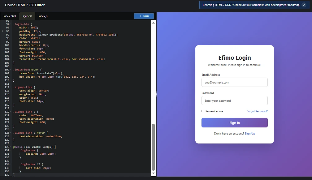
Now open style.css and add the following styles.
css
* {
    margin: 0;
    padding: 0;
    box-sizing: border-box;
    font-family: 'Segoe UI', Tahoma, sans-serif;
}

body {
    min-height: 100vh;
    display: flex;
    justify-content: center;
    align-items: center;
    background: linear-gradient(135deg, #667eea 0%, #764ba2 100%);
}

.login-container {
    width: 100%;
    max-width: 420px;
    padding: 20px;
}

.login-box {
    background: #ffffff;
    padding: 40px 30px;
    border-radius: 16px;
    box-shadow: 0 20px 60px rgba(0, 0, 0, 0.2);
}

.login-box h2 {
    text-align: center;
    color: #333;
    margin-bottom: 8px;
    font-size: 28px;
}

.subtitle {
    text-align: center;
    color: #777;
    margin-bottom: 30px;
    font-size: 14px;
}

.input-group {
    margin-bottom: 20px;
}

.input-group label {
    display: block;
    margin-bottom: 6px;
    color: #555;
    font-size: 14px;
    font-weight: 500;
}

.input-group input {
    width: 100%;
    padding: 12px 14px;
    border: 1px solid #ddd;
    border-radius: 8px;
    font-size: 14px;
    transition: all 0.3s ease;
}

.input-group input:focus {
    outline: none;
    border-color: #667eea;
    box-shadow: 0 0 0 3px rgba(102, 126, 234, 0.15);
}

.options {
    display: flex;
    justify-content: space-between;
    align-items: center;
    margin-bottom: 25px;
    font-size: 13px;
}

.remember {
    color: #555;
    display: flex;
    align-items: center;
    gap: 6px;
}

.forgot {
    color: #667eea;
    text-decoration: none;
}

.forgot:hover {
    text-decoration: underline;
}

.login-btn {
    width: 100%;
    padding: 12px;
    background: linear-gradient(135deg, #667eea 0%, #764ba2 100%);
    color: white;
    border: none;
    border-radius: 8px;
    font-size: 16px;
    font-weight: 600;
    cursor: pointer;
    transition: transform 0.2s ease, box-shadow 0.2s ease;
}

.login-btn:hover {
    transform: translateY(-2px);
    box-shadow: 0 8px 20px rgba(102, 126, 234, 0.4);
}

.signup-link {
    text-align: center;
    margin-top: 20px;
    color: #555;
    font-size: 14px;
}

.signup-link a {
    color: #667eea;
    text-decoration: none;
    font-weight: 600;
}

.signup-link a:hover {
    text-decoration: underline;
}

@media (max-width: 480px) {
    .login-box {
        padding: 30px 20px;
    }

    .login-box h2 {
        font-size: 24px;
    }
}
What This CSS Does
- Applies a purple gradient background for a modern look.
- Centers the login box vertically and horizontally using flexbox.
- Adds a soft shadow to make the form feel elevated.
- Includes focus effects on inputs and a hover lift on the button.
- Uses a media query to keep the layout clean on smaller screens.
Preview the Output
Now I’ll show you a live preview of what the page actually looks like in the browser:
Efimo Login Page Live Output Preview
When you open index.html in your browser, you’ll see:
Final Output Result
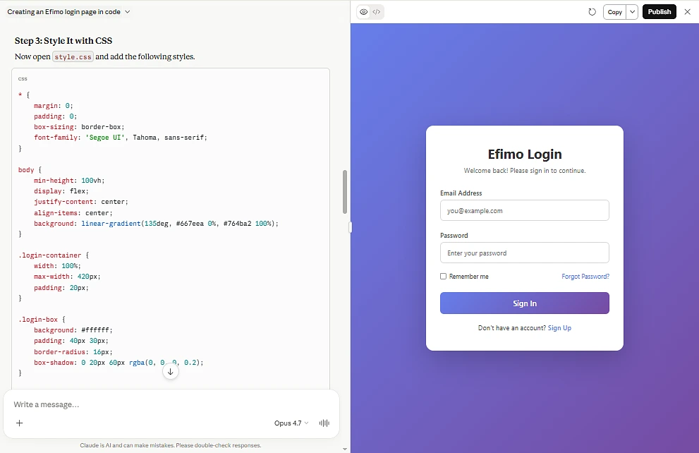
- A centered white login card floating on a purple gradient background.
- A clean heading “Efimo Login” with a friendly subtitle.
- Two styled input fields for email and password.
- A “Remember me” checkbox on the left and “Forgot Password?” link on the right.
- A bold gradient Sign In button that lifts up on hover.
- A “Sign Up” link at the bottom for new users.
Hovering over the Sign In button gives a subtle lift effect with a colored shadow, and clicking inside an input field highlights it with a soft purple glow.