



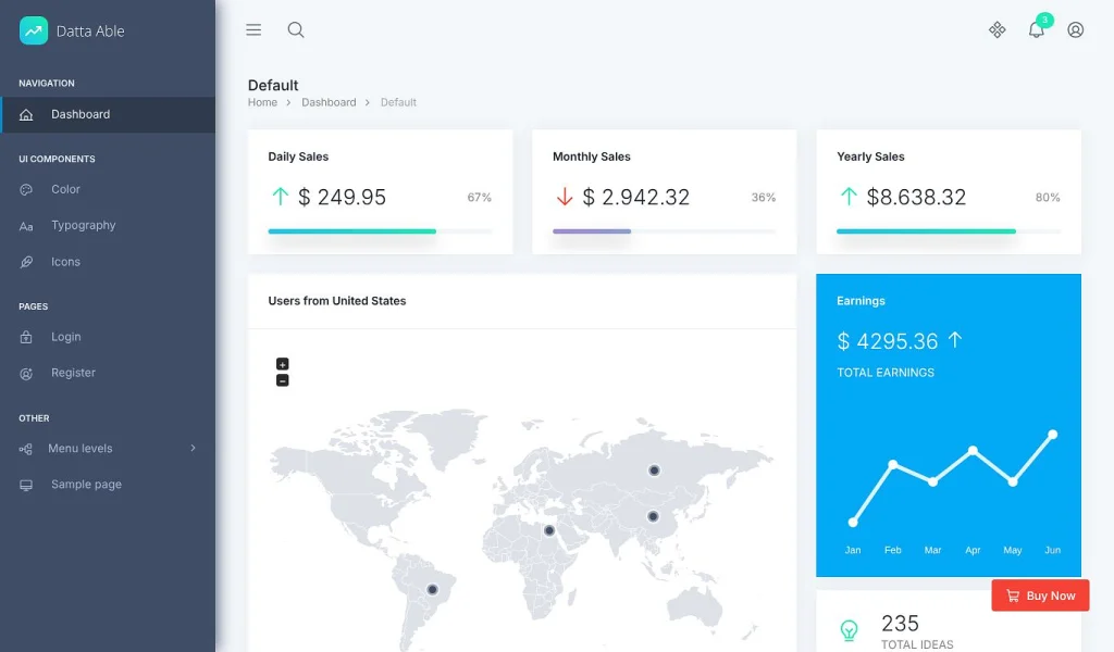
I cloned the free Datta Able Tailwind template from GitHub, opened the built files in a browser, read the Tailwind config and switched the theme and colour presets by hand. Everything below comes from that, with screenshots from the actual files.

What Datta Able Tailwind Is, in One Paragraph
Datta Able is an admin dashboard template from CodedThemes. The Tailwind edition is plain HTML, CSS and JavaScript built on Tailwind CSS 4, compiled with Gulp. The free version is MIT licensed and includes a dashboard, login, register, three UI element pages and a sample page. The Pro version adds the application pages, extra layouts and the live customiser for $49.
- Stack: HTML partials joined with
gulp-file-include, Tailwind 4 through PostCSS, vanilla JavaScript. No React, Vue or Angular here. CodedThemes sells those as separate products. - Licence: MIT on the free download, so you can use it in client and commercial work.
- Pro price: $49 single use, $69 multi use, $299 extended, $399 multi extended, one-time.
- Last Pro update on the sales page: July 24, 2025, which moved it to Tailwind 4.
Free Version Against Pro: What Is Really in the Download

The README says “6 demo pages.” After cloning, the real count is 7 page files plus 11 layout partials. Here is what the free download has and what Pro keeps back.
| Feature | Free (MIT) | Pro ($49+) |
|---|---|---|
| Dashboard pages | 1 (Default) | 7 (Default, Analytics, Ecommerce, CRM, Crypto, Finance, Project) |
| Auth pages | Login, Register | Full set |
| UI element pages | Color, Typography, Icons | 65+ card components and the full component set |
| Application pages | None | Chat, Calendar, To-do, Gallery, Profile, Task list, Invoice |
| Layouts | Vertical sidebar | Vertical, Horizontal, Compact, Tab and more |
| Dark mode | Works (CSS is in the free build) | Yes, with a customiser switch |
| Colour presets | 17 presets in presets.css | Same, with a customiser panel |
| RTL and multi-language | Not wired up | Yes |
| Live customiser panel | Placeholder only | Yes |
Dark mode and the colour presets are the surprise. The README lists both under Pro, but the free build already ships the CSS and the JavaScript for them. The next sections show how to switch them on.
Where Everything Lives in the Folder

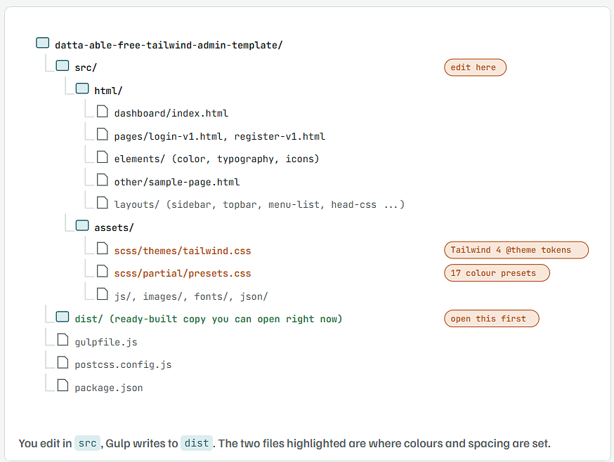
src/htmlholds the pages. Each page is a shell that pulls in the sidebar, topbar and footer with@@includelines.src/html/layoutsholds those shared pieces. Editmenu-list.htmlonce and every page’s sidebar changes.src/assets/scss/themes/tailwind.cssis the Tailwind 4 entry file. It imports Tailwind, declares the design tokens in an@themeblock and sets the primary colour scale in:root.distis a finished build. It is about 25 MB because it includes every plugin CSS and JS file.
See It Running in Two Minutes Without Node
The repository ships a built dist folder, so you can look before you install anything.
git clone https://github.com/codedthemes/datta-able-free-tailwind-admin-template.git
cd datta-able-free-tailwind-admin-template/dist
python3 -m http.server 8080
What you should see
Serving HTTP on 0.0.0.0 port 8080 (http://0.0.0.0:8080/) ...
- Open
http://localhost:8080/dashboard/index.htmlin your browser. - On Windows without Python, right-click
dist/index.htmland open it in a browser. The pages work from the file system too. - A local server is better than double-clicking because the vector map and fonts load the way they will on a real site.
Install the Build Tools and Start Live Reload
To edit the source and see changes as you save, you need Node.js. The template uses Gulp 4 with BrowserSync.
node -v
npm install
npm start
npm installpulls in about 900 packages, because the Pro plugin list (DataTables, FullCalendar, TinyMCE, ApexCharts and more) is in the freepackage.jsontoo. Give it a few minutes on a slow connection.npm startruns the default Gulp task: it clearsdist, copies plugins, compiles Tailwind, joins the HTML partials and opens BrowserSync.npm run builddoes the same with minified CSS, JS and HTML for upload.- Use Node 18 or newer. The package list includes Babel 7 and Sass, both of which are happy on current LTS releases.
Gulp not found after install? The install didn't finish. Runnpm installagain and watch for network errors. Gulp lives innode_modules/.bin, andnpm startfinds it there once it exists.
Switch Dark Mode On in the Free Version
Every page sets data-pc-theme="light" on the <html> tag. The Tailwind entry file defines a custom dark variant that reads that attribute. Change the attribute and the whole page flips.
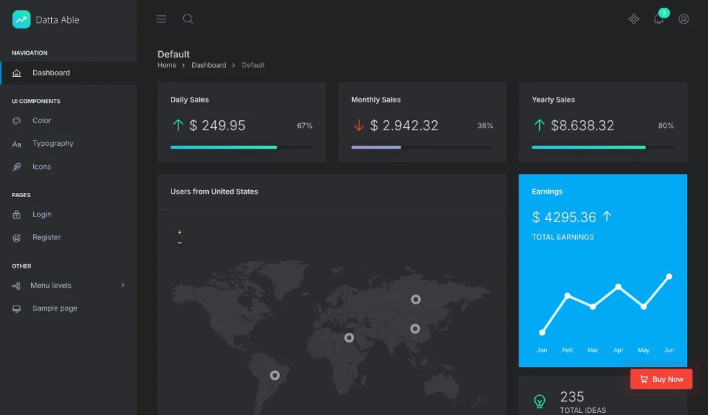
This is the line in src/assets/scss/themes/tailwind.css that makes it work:
@custom-variant dark (&:where([data-theme=dark], [data-pc-theme="dark"] *));
To make dark the default, change the attribute on each page’s <html> tag, or set it once in src/html/layouts/head-page-meta.html if your pages pull it from there:
<html lang="en" data-pc-theme="dark" data-pc-preset="preset-1" data-pc-direction="ltr">
To give users a toggle, the free theme.js already has the function. It saves the choice in localStorage and follows the system setting on first load. Add a button anywhere and call it:
<button type="button" onclick="layout_change('dark')">Dark</button>
<button type="button" onclick="layout_change('light')">Light</button>
Change the Brand Colour With One Class or One Variable
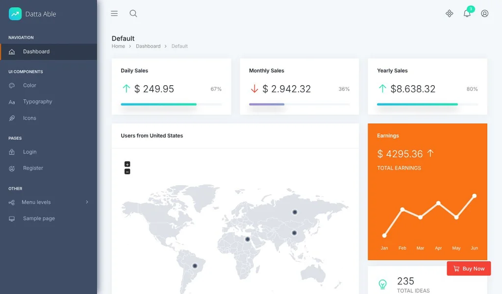
The sky-blue default is preset-1. The file src/assets/scss/partial/presets.css holds 17 more, each a full 50-to-950 scale on CSS variables. The free theme.js applies a preset by setting a class on the <html> tag.
Option A: Pick a Built-in Preset
<html lang="en" class="preset-3" data-pc-theme="light" data-pc-preset="preset-3" data-pc-direction="ltr">
- Presets 2 to 18 are red, orange, amber, green, teal, blue, indigo, purple and so on, each with the full shade scale.
- The class is what does the work. The
data-pc-presetattribute is only there for the customiser panel to read.
Option B: Set Your Own Brand Colour
Open src/assets/scss/themes/tailwind.css, find the :root block, and replace the primary scale. These are the lines for the default blue:
:root {{
    --primary-50: #B3E6FE;
    --primary-100: #9FE0FD;
    --primary-200: #77D2FD;
    --primary-300: #4EC5FC;
    --primary-400: #26B8FB;
    --primary-500: #04A9F5;   /* the main brand colour */
    --primary-600: #0383BE;
    --primary-700: #025D87;
    --primary-800: #01374F;
    --primary-900: #001118;
    --primary-950: #070B0D;
}}
- Paste your own 11 shades in. A tool such as the Tailwind colour generator at uicolors.app gives you the full scale from one hex code.
- The
@themeblock above it maps--primary-500to Tailwind’s--color-primary, so classes likebg-primary,text-primary-700andborder-primary-200all pick up the change. - Run
npm startornpm run buildto compile it intodist/assets/css/style.css.
Add Your Own Page and a Sidebar Link
Every page follows the same pattern, so copying the sample page is the quickest start.
cp src/html/other/sample-page.html src/html/other/orders.html
Open the new file and change the two include lines that carry text:
@@include('../layouts/head-page-meta.html', {{'title': 'Orders'}})
...
@@include('../layouts/breadcrumb.html', {{'breadcrumb-item': 'Shop', 'breadcrumb-item-active': 'Orders'}})
Put your content inside the pc-content div using Tailwind classes and the template’s card styles:
<div class="grid grid-cols-12 gap-x-6">
  <div class="col-span-12 lg:col-span-8">
    <div class="card">
      <div class="card-header"><h5>Recent orders</h5></div>
      <div class="card-body">
        <p class="mb-0">Orders table goes here.</p>
      </div>
    </div>
  </div>
</div>
Then add a link in src/html/layouts/menu-list.html. Copy an existing pc-item block and change three things:
<li class="pc-item">
  <a href="../other/orders.html" class="pc-link">
    <span class="pc-micon"><i class="ph ph-shopping-cart"></i></span>
    <span class="pc-mtext">Orders</span>
  </a>
</li>
- Icons come from Phosphor. The free Icons page lists every name you can use after
ph-. - Save, and BrowserSync reloads with the new page in the sidebar on every screen.
Three Things to Strip Before You Ship a Client Site
- The “Buy Now” badge. It sits in
src/html/layouts/footer-js.htmlas a link to the CodedThemes store. Delete that<a>block. - The tracking pixel. The same partial loads a script from
fomo.codedthemes.com. Remove the<script>line so your client’s admin panel isn’t calling a third-party server. - The unused plugins.
dist/assetscarries CSS and JS for every Pro plugin. Keep only what your pages load. The dashboard page needsjsvectormapandapexchartsand nothing else from that folder.
Who the Free Datta Able Tailwind Template Suits
- Good fit: a small internal tool, a client admin panel with a handful of screens, or a Tailwind 4 starting point where you’ll build your own pages. The partial system and the token file save real time.
- Buy Pro if: you need the chat, calendar, invoice or e-commerce pages ready-made, the horizontal or compact layouts, or RTL. Rebuilding those yourself costs more than $49.
- Look elsewhere if: you want a React, Vue or Angular codebase. Datta Able has those, but they are separate products with their own repos.