

If you’ve ever wanted to add a subtle, stylish effect to your web pages, using a semi-transparent background can be a fantastic way to achieve just that. Whether you’re designing a modern website, a sleek app, or just exploring the power of CSS, creating a semi-transparent background is a simple yet impactful technique.

Creating a semi-transparent background in CSS is a fundamental design technique used to create depth, overlays, and readable text on top of images.
What is Semi-Transparent Background
Before diving into the code, let’s first understand what we mean by a “semi-transparent background.” In web design, a transparent background is one where the background content is see-through, allowing the elements behind it to show through. A “semi-transparent” background, on the other hand, is one where you can still see the background, but it’s not fully opaque it’s partly transparent.
This is useful for layering content or adding depth to your design without completely hiding what’s beneath the element. Think of it like a frosted window: you can still see through it, but the view is softened and blurred.
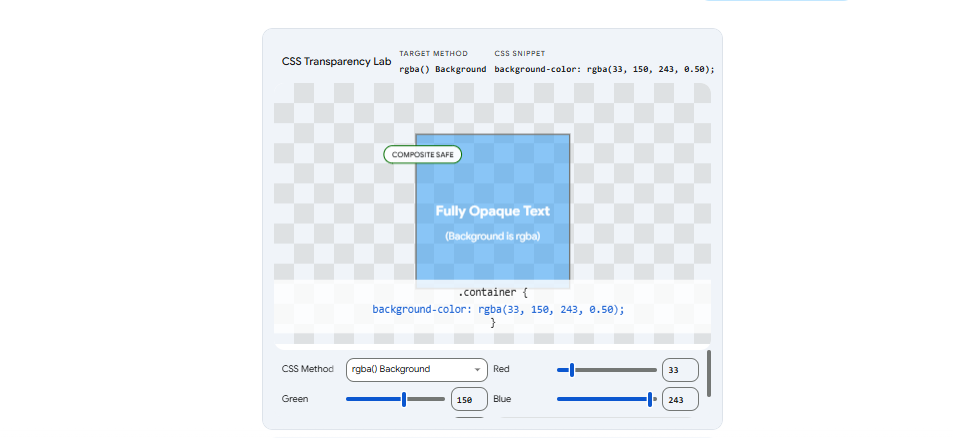
1. Using rgba() (The Recommended Method)
This method allows you to set a semi-transparent color for the background without affecting the text or other elements inside the container.
- Syntax:
background-color: rgba(red, green, blue, alpha); - The Alpha Value: This ranges from
0(completely transparent) to1(completely solid). For a semi-transparent effect, use a decimal like0.5.
Example:
CSS
.box {
  /* 50% transparent black background */
  background-color: rgba(0, 0, 0, 0.5);
  color: white; /* The text remains 100% solid and readable */
}
2. Using the opacity Property
The opacity property makes the entire element transparent. This includes the background, the borders, and most importantly, any text or images inside it.
- Syntax:
opacity: value;(where value is0to1) - Warning: If you use this on a container with text, the text will also become faded and may be difficult to read.
Example:
CSS
.faded-box {
  background-color: black;
  opacity: 0.5; /* The background AND the text become 50% transparent */
}
3. Using Hex Codes with Alpha
Modern CSS also supports 8-digit Hex codes. The last two digits represent the transparency (Alpha).
- Format:
#RRGGBBAA - Example:
#00000080is black at approximately 50% opacity.
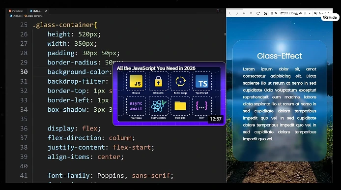
4. Advanced Effect: Glassmorphism
If you want to create a “frosted glass” effect, you can combine a semi-transparent rgba() background with the backdrop-filter property to blur what is behind the element.
CSS
.glass-effect {
  background-color: rgba(255, 255, 255, 0.3);
  backdrop-filter: blur(10px);
  -webkit-backdrop-filter: blur(10px); /* For Safari support */
}
Use the interactive tool below to experiment with the different methods and see exactly how they affect the background and the text inside.