


To build a responsive search bar, you wrap an <input> and a <button> inside a <form> or <div> container. Use CSS Flexbox on the container to ensure the input expands to fill the space while the button stays a fixed size.
Steps to Build Search Bar

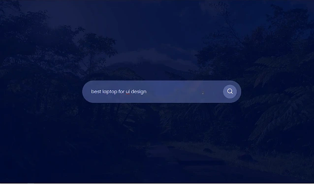
- HTML Structure: Create a container with an input field and a search button.
- Flexbox Layout: Set the container to
display: flexso the items sit side-by-side. - Responsiveness: Use
width: 100%on the container andflex-grow: 1on the input field. - Styling: Add padding, remove default borders, and add a hover effect for a polished look.

The Fix: Common Error
The Error: Many beginners use fixed pixel widths (e.g., width: 500px). When the screen gets smaller than 500px, the search bar breaks the layout or gets cut off. The Fix: Use max-width for desktop and width: 100% for mobile.
1. HTML Structure

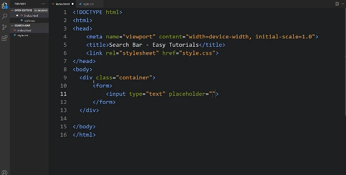
The search bar typically consists of a <form> containing an <input> for text and a <button> for submission.
html
<div class="search-container">
  <form action="/search" method="get">
    <input type="text" placeholder="Search..." name="q" class="search-input">
    <button type="submit" class="search-btn">
      <!-- You can use a FontAwesome icon here -->
      <i class="fa fa-search"></i> Search
    </button>
  </form>
</div>
2. CSS Styling

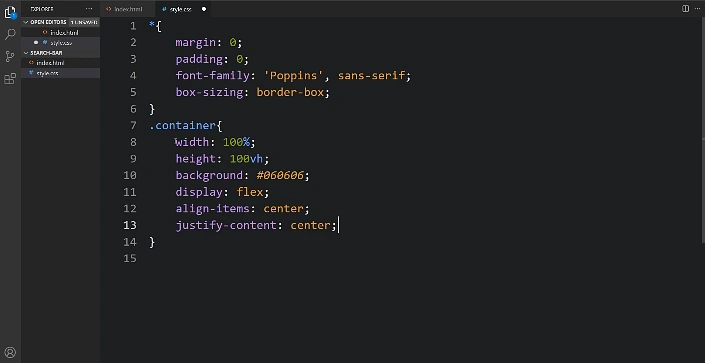
Use Flexbox to keep the input and button aligned horizontally while ensuring they take up the appropriate space.
css
/* Container for the search bar */
.search-container form {
  display: flex;
  max-width: 600px; /* Limits width on large screens */
  margin: 0 auto;
  border: 2px solid #ccc;
  border-radius: 25px;
  overflow: hidden;
}

/* Input field styles */
.search-input {
  flex: 1; /* Allows input to grow and fill space */
  border: none;
  padding: 10px 20px;
  outline: none;
  font-size: 16px;
}

/* Button styles */
.search-btn {
  background-color: #2196F3;
  color: white;
  border: none;
  padding: 10px 20px;
  cursor: pointer;
  transition: background 0.3s ease; /* Smooth hover effect */
}

.search-btn:hover {
  background-color: #0b7dda;
}
3. Making it Responsive
Use media queries to adjust the search bar for smaller screens (e.g., mobile devices). A common technique is to stack the elements or make them full-width when the screen is narrow.
css
/* Adjustments for screens smaller than 600px */
@media screen and (max-width: 600px) {
  .search-container form {
    flex-direction: column; /* Stacks input and button vertically */
    border: none;
    max-width: 100%;
  }

  .search-input, .search-btn {
    width: 100%;
    margin-bottom: 5px;
    border: 1px solid #ccc;
    border-radius: 5px;
  }
}
Key Best Practices
- Accessibility: Include a
<label>(can be visually hidden) for screen readers and ensure high color contrast. - Visual Feedback: Add focus states (e.g.,
box-shadowor border color change) so users know when the input is active. - Icons: Use libraries like Font Awesome to add a magnifying glass icon for better recognition.